Is your bathroom dull, uninspired or simply lacking that vital touch of character? The solution lies in colour. But we’re not talking a standard lick of matt white paint here; we’re thinking it’s time for something a little more drastic. Colour drenching is one of the most effective ways to make a bathroom look more intentional and immersive, and is a design method every homeowner should be familiar with.
But what is colour drenching, and how do you get it right without turning your bathroom into something you'll regret every morning? Use this practical guide to acquaint yourself with colour drenching and learn how to implement a colour-drenched bathroom using layers and proven colour schemes.
- What is Colour Drenching?
- The Benefits of Colour Drenching a Bathroom
- How to Colour Drench Bathrooms: The 5-Layer Method
- Best Colours for Colour Drenching a Bathroom
- FAQ About Bathroom Colour Drenching
- Ready to Start Your Colour Drenched Bathroom?
What is Colour Drenching?
Colour drenching is the interior design practice of decorating a room in a single colour or a family of closely related shades. Rather than picking different colours for different surfaces and introducing contrast at every turn, you commit to one cohesive palette and carry it across the entire space, cultivating a unified and intentional aesthetic.
What is Bathroom Colour Drenching?
Highlighted as a standout movement in our 2026 bathroom trends report, colour drenching in a bathroom utilises the same single-palette principle and applies it to everything bathroom-related. That means choosing colour-matched wall panels and floor tiles, then finishing the scheme with tonally consistent furniture, brassware and accessories.
The results can be calm and spa-like, bold and boutique or soft and understated, depending on the colour you choose. In any case, the end goal is to reduce the harsh contrasts typically associated with a modern bathroom. Think less clinical and more personal.
We must reiterate here that bathroom colour drenching doesn't mean that every surface has to be identical. A green colour-drenched bathroom, for example, could combine sage wall paint, eucalyptus tiles and olive furniture. While every element is a different shade, they all sit within the same colour family to form a unified theme.
The Benefits of Colour Drenching a Bathroom
Colour drenching works in any room, but the bathroom is where its benefits shine through most brightly. Here's what a single-palette approach can do for your space:
- Create cohesion: Bathrooms, particularly the standard small British kind, are naturally busy rooms. After all, ceramic, glass, wood and stone all jumbled together in varying forms can often make a space feel cluttered. A limited colour palette will rein everything in, knocking out the competing elements and tying it all together.
- Adds atmosphere: Bathrooms are enclosed, often windowless spaces. Believe it or not, that actually works in your favour here. A drenched palette lands far better in a compact bathroom than it ever would in a big, wide-open living room. With the right colour, you can swiftly land a spa or boutique hotel atmosphere without overthinking.
- Highlight fixtures: Bathrooms have many functional yet utilitarian fixtures. However, against the controlled tonal backdrop of a colour-drenched space, those same fixtures start to read as assured design choices rather than simple necessities. A brushed brass basin mixer, for example, makes a much stronger visual statement against an olive-green wall than it does competing with three different tile colours and a contrasting splashback.
- Simplifies product choices: Bathrooms involve many product decisions, and making them all work together can seem an overwhelming prospect. Fortunately, colour drenching simplifies the whole process. Once you’ve picked your colour family, that’s most of the hard work done. Every subsequent choice becomes a case of simply finding the right shade or finish within that palette, rather than agonising over whether your vanity unit clashes with your wall tiles.
How to Colour Drench Bathrooms: The 5-Layer Method
Colour drenching a bathroom isn't about painting everything the same shade and hoping for the best. It works best when you think in layers, building from the largest surfaces and finishing on the smallest details. Each layer adds depth and tonal variation while keeping the overall palette close-knit.
Layer 1: The Base Colour
This is the foundation upon which everything depends. Your base colour covers the largest visible area in the room: the walls and the ceiling. The base doesn’t have to be the darkest or the lightest tone in the palette; it just needs to be the anchor keeping every other element in check.
As a side note, if using tiles, this is where tile drenching comes in. It works by using the same tile design from your main tonal family across multiple walls, rather than restricting it to a single accent wall or shower enclosure.
Layer 2: Fixed Surfaces
The second layer covers surfaces that aren’t your main walls or ceiling, but still occupy significant visual space. This mainly applies to your floor, but can also include sanitaryware, countertops, bath panels and any architectural panelling.
These surfaces don't need to match the base colour exactly. In fact, they shouldn't! Choose a lighter or darker shade of the base colour, or opt for an entirely different finish within the broader colour umbrella. Essentially, the second layer is about breaking up the larger elements to prevent the whole scheme from feeling oppressive and suffocating.
For shower enclosures and wetroom spaces, Showerwall panels are well worth a look here. These waterproof wall panels come in a wide range of tones and finishes, so matching them to your chosen palette is a lot easier than you might think.
Layer 3: Furniture
This is where colour drenching really starts to come together. Sure, the walls, ceiling and floor may set the tone, but bathroom furniture brings the whole palette forward into the realm of the tangible and the tactile. It's the layer you see up close, touch, and interact with every day.
Take your lead from Layer 2 here. If your fixed surfaces are a shade or two apart from the base colour, your furniture should follow that same direction. A vanity unit or WC unit in a shade similar to the floor keeps everything grounded, but like layer 2, not so close that it all blends into one.
Layer 4: Brassware and Heating
This is the layer that’s trickiest to implement, often making or breaking the entire look. Brassware and bathroom heating fall into their own category when colour-drenching a bathroom, and ought to clearly stand out to create a significant contrast.
In lighter schemes of greens, creams and warm neutrals, warm metallics like brushed brass or brushed gold will feel like a natural part of the palette. In contrast, darker schemes like black, dark blue or purples need something colder and more intense when it comes to brassware and radiators. Gunmetal grey and brushed nickel sit very comfortably against such mood-driven backdrops, reinforcing the industrial vibe without cutting through it.
Of course, standard chrome still just about works in most schemes. In a colour-drenched bathroom, however, chrome can stick out conspicuously. A tailored, considered finish blends in much more naturally, so it’s always worth looking beyond the basics.
Layer 5: Accessories and Lighting
Time for the final touches! We’re talking towels, mirrors, accessories, bathroom lighting, and the best choices of bathroom plants. For this step, take your cues from Layer 4 and make these items stand out. If you've gone with brushed brass taps and a matching radiator, apply that same finish to your mirror frame, robe hooks, toilet roll holder and shower niche. The closer these finishing details sit to your brassware, the more polished the overall effect will appear.
Layer 4 is also the easiest one to tweak if something looks off. Too intense? A lighter towel or a neutral accessory can dial it back. Too flat? A collection of potted plants or a backlit mirror frame can add just enough interest to lift the room.
Don't overlook layered lighting and colour temperatures here either – they matter more in a colour-drenched bathroom than almost anywhere else in the house. Darker schemes need enough light to feel cosy rather than gloomy, and lighter schemes can easily look washed out without the right level of warmth. Think about combining task lighting around the mirror with ambient light from above, and perhaps even throw in an accent or shelf light to give the room more of a vibe after dark.
Best Colours for Colour Drenching a Bathroom
As with any bathroom colour scheme, your choice comes down to your bathroom's size, the amount of natural light and the mood you're trying to create. That said, some colour families lend themselves to drenching better than others. Here are five that work particularly well:
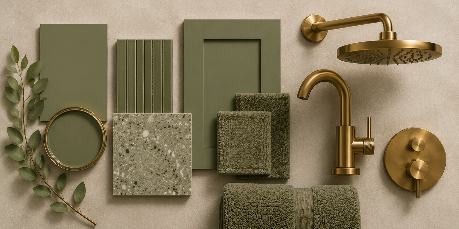
1. Soft Greens and Sages
Green is one of the most popular bathroom colour choices right now, and for good reason. A pillar of biophilic design, green evokes nature, calms without feeling cold, and works beautifully with both warm brass and cool chrome finishes.
Olive, eucalyptus, and muted mint all sit within this family, giving you plenty of tonal range to play with across the five layers.
Complete The Look:
- Walls and main surfaces: Sage, eucalyptus, muted mint or soft olive.
- Floors: Warm stone, limestone-effect, soft beige, pale grey-green or natural wood-effect finishes.
- Furniture: Oak, fluted wood, white, soft grey-green or deeper olive vanity units.
- Brassware: Brushed brass for warmth and a spa-like feel, or chrome for a fresher, more classical look.
- Accessories: Off-white towels, woven baskets, timber shelves, stone trays and greenery.
2. Deep Blues and Purples
Darker blues and purples give your bathroom a regal, enveloping quality that's hard to achieve with any other palette. They're naturally luxurious and just a wee bit dramatic (in the best possible way, of course). Both colours work best when you fully lean into the moodiness rather than tiptoeing around it. These palettes suit both traditional and contemporary spaces, photographing exceptionally well. This is worth considering if you're renovating with resale in mind.
Other shades worth exploring are navy, ink and midnight blue, perfect for invigorating your space with a vibrant intensity. On the other hand, plum, aubergine and damson introduce a richness that pure blues can sometimes lack. Ultimately, it’s all about the specific aesthetic you want to achieve.
Complete The Look:
- Walls and main surfaces: Navy, ink, midnight blue, aubergine, plum or damson.
- Floors: Slate, charcoal, dark marble-effect, pale stone, soft grey or patterned monochrome tiles.
- Furniture: Navy, dark wood, walnut, white or colour-matched finishes.
- Brassware: Chrome for a crisp finish, or brushed brass/bronze for warmth and luxury.
- Accessories: White towels, smoked glass, dark wood, warm metallic details and soft lighting.
3. Terracotta and Clays
Terracotta and clay are inherently earthy and organic. This is the kind of palette that makes a bathroom seem truly handcrafted, enriched with an aching sense of rustic nostalgia. There's a warmth to these tones that you don't get from cooler palettes, almost Mediterranean in character, and pairing naturally with textured tiles, natural stone and linen-effect accessories.
Red brick, ochre, umber, and burnt orange all occupy the same territory. Just remember, full-strength terracotta or clay might feel a tad heavy for larger surfaces. Softer shades like dusty rose, powdered clay and warm sandstone are much easier to live with. Save the deeper, richer tones for furniture and flooring, where they can make the right impact without overwhelming the room.
Complete The Look:
- Walls and main surfaces: Plaster pink, powdered clay, warm sandstone, terracotta, rust or umber.
- Floors: Warm stone, beige porcelain, limestone-effect tiles, terrazzo or muted patterned tiles with earthy undertones.
- Furniture: Oak, cream, warm white, clay-coloured or dark wood.
- Brassware: Brushed brass, bronze or aged brass for warmth, or matt black for a more contemporary edge.
- Accessories: Linen-look towels, ceramic accessories, woven storage and warm white lighting.
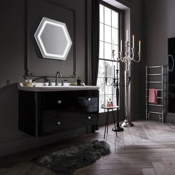
4. Blacks and Greys
There’s no denying that a fully drenched dark bathroom takes a certain audacity to pull off. But when it really lands, it's one of the most striking looks in contemporary bathroom design. The key is variation - charcoal on the walls, a lighter grey on the floor, anthracite furniture and matt black brassware, all working within the same spectrum without ever falling flat.
Ironically, lighting does a lot of the heavy lifting in a darker scheme. Without enough of it, cosy tips into gloomy fast. A mix of task lighting around the mirror, ambient light from above and an accent or shelf light will keep things inviting rather than closed in. White sanitaryware helps too, as it gives the eye somewhere to rest and stops the palette from becoming relentless.
If a full black approach sounds like too much, slate, graphite, pewter and storm grey offer a softer way in while still delivering that moody, considered feel.
Complete The Look:
- Walls and main surfaces: Charcoal, graphite, slate, pewter, storm grey or black.
- Floors: Slate-effect, concrete-effect, terrazzo, marble-effect or large-format grey tiles.
- Furniture: Anthracite, black, dark wood or a softer grey tone.
- Brassware: Matt black for a seamless modern look, or brushed brass, bronze or gunmetal for contrast.
- Accessories: White towels, smoked glass, black-framed mirrors, stone trays and layered lighting.
5. Creams and Beiges
Colour drenching isn’t always a straight choice between bright and bold or dark and daring. A neutral palette can deliver the same curated, carefully layered effect, simply doing so a little more quietly. Neutral tones are a natural fit for family bathrooms, ensuites, rented homes, or any other space that needs to look clean and bright.
The only real risk with neutrals is blandness. When colour isn't doing the talking, texture must pick up the slack. Textured wall tiles, ribbed accessories, natural wood accents and warm metallic brassware all help to dispel that wet, one-note feeling.
If plain cream and beige sound too safe, there’s no need to despair. Oatmeal, sand and stone offer a bit more character while keeping the same calm, easy-to-live-with quality.
Complete The Look:
- Walls and main surfaces: Warm white, cream, oatmeal, sand, taupe, stone or beige.
- Floors: Limestone-effect, travertine-effect, pale wood-effect, warm grey or soft beige porcelain.
- Furniture: Oak, fluted wood, white, mushroom, taupe or cashmere finishes.
- Brassware: Chrome for a clean classic look, or brushed brass, bronze or nickel for warmth.
- Accessories: Ribbed towels, natural baskets, ceramic soap dishes, wooden stools, warm lighting and subtle stone or marble details.
FAQ About Bathroom Colour Drenching
What Paint Should You Use for Colour Drenching?
The best paint for colour drenching depends entirely on the surface you are painting. In bathrooms, always choose a specifically moisture-resistant bathroom paint for walls and ceilings. Be sure to use the correct primer and finish for woodwork, doors, or furniture, too. A matt or soft-sheen finish creates a softer, more seamless look, while eggshell and satin are better for trims, doors and other areas that require extra durability.
Does Colour Drenching Make a Room Smaller?
Many people hesitate to colour drench in small bathrooms, and that’s completely understandable. The logic seems obvious; the thought of wrapping an already tight space in a deep or saturated shade sounds like a recipe for stifling visual oppression. In fact, it’s the complete opposite! Colour drenching can actually make a room feel markedly bigger. Using a single colour family across walls and ceilings, along with furniture to reduce visual breaks, helps the room look more cohesive. Very dark shades can appear more enclosed in poor lighting, so the key is choosing the right tone and balancing it with mirrors, lighting and reflective finishes.
Ready to Start Your Colour Drenched Bathroom?
Colour drenching isn't about following a rigid formula; it's about making deliberate choices that work together. Start with a colour you're drawn to, build out through the five layers, and don't be afraid to commit. The bathrooms that look most impressive are rarely the ones with the most variety. They're the ones in which every element belongs, fulfilling its prescribed position with confidence and swagger.
If you're ready to start planning, browse our collections to find pieces that fit your palette. And if you need a hand pulling it all together, contact us today. Our team is always happy to help.

